
Almost every dark mode starts the same way: a useState, an isDark boolean, and a ternary. At first it looks harmless. A component here, another there. Six months later the project has isDark imported in forty files, ternaries deciding colors in the JSX, and every time a designer adds a third theme (the "high contrast mode" they asked to support), you get to open those forty files.
The problem is not dark mode. The problem is that theming is being treated as business logic when it should be infrastructure. This article is about how to move that decision to a single place and make if (isDark) disappear from your component code.
1. The problem: if (isDark) scattered all over the code
Almost every developer, when facing a website or application that needs different themes, writes a pattern like this for the first time:
1function PriceTag({ amount, isDark }: PriceTagProps) {
2  return (
3    <span
4      style={{
5        color: isDark ? '#F5F5F5' : '#1A1A1A',
6        backgroundColor: isDark ? '#2A2A2A' : '#FFFFFF',
7        borderColor: isDark ? '#444444' : '#DDDDDD',
8      }}
9    >
10      {amount} €
11    </span>
12  )
13}
It works. The problem is what happens when you multiply it. When it is no longer a single screen but 20 different ones, with new components, different flows, new behaviors... Every component that paints something has to:
- Receive or read
isDarkfrom somewhere. - Know the two color values for each property.
- Choose between them with a ternary.
Three things that should be independent become coupled: what you are (a price), what visual role you have (primary text on a surface), and what concrete color corresponds to that role in the active theme. The component should know nothing about the third point.
The clearest symptom that you are on the wrong path is searching for isDark in the project and finding it in the UI components. If a button knows whether there is a dark mode, theming has stopped being infrastructure and has become a dependency you drag everywhere.
2. The mindset shift: don't ask about the theme, ask about the role
The key is to flip the question. Instead of the component asking "are we in dark mode?" and deciding a color, the component declares "I am primary text on a surface" and lets the system resolve the color.
A raw color like #1A1A1A says nothing about its intent. text-primary does: it is the color of the most important text, whatever the theme. That name is a semantic token, and it is the piece that breaks the chain of ternaries.
The difference is subtle but it changes everything:
1// Before: the component decides the color
2color: isDark ? '#F5F5F5' : '#1A1A1A'
3
4// After: the component declares a role, the theme decides
5color: 'var(--color-text-primary)'
In the second version there is no condition. There is no boolean. The component does not even know how many themes exist. You could add a third theme tomorrow and this code would not change.

3. Semantic tokens: surface, not gray-900
Here it helps to distinguish two layers of tokens, because mixing them is a common mistake.
The first layer are the primitive tokens: the raw palette. gray-900, blue-500, red-600. They are fixed values, they do not change between themes. They are the box of paints.
The second layer are the semantic tokens: they name an intent, not a color. surface, text-primary, border-subtle, accent. These do change depending on the theme, and they always point to a primitive token.
1:root {
2  /* Layer 1: primitives (never change) */
3  --gray-50:  #F9FAFB;
4  --gray-100: #F3F4F6;
5  --gray-800: #1F2937;
6  --gray-900: #111827;
7  --indigo-400: #818CF8;
8  --indigo-500: #6366F1;
9
10  /* Layer 2: semantics for the light theme */
11  --color-surface:      var(--gray-50);
12  --color-text-primary: var(--gray-900);
13  --color-border-subtle: var(--gray-100);
14  --color-accent:       var(--indigo-500);
15}
The mental rule is simple: components only consume semantic tokens, never primitives. A component that uses var(--gray-900) directly is coupled to a concrete color again. One that uses var(--color-text-primary) is immune to the theme.
Name semantic tokens by their function, not by their appearance. --color-text-primary survives a redesign; --color-dark-gray-text does not. If tomorrow the primary text turns navy blue, the name is still correct.
4. The theme provider: a single point that decides
With the semantic tokens defined, switching theme means redefining which primitive each semantic points to. And that happens in a single place.
In pure CSS, an attribute on the <html> (or on body) is enough:
1/* Light theme: already defined in :root above */
2
3[data-theme='dark'] {
4  --color-surface:       var(--gray-900);
5  --color-text-primary:  var(--gray-50);
6  --color-border-subtle: var(--gray-800);
7  --color-accent:        var(--indigo-400);
8}
9
10[data-theme='high-contrast'] {
11  --color-surface:       #000000;
12  --color-text-primary:  #FFFFFF;
13  --color-border-subtle: #FFFFFF;
14  --color-accent:        #FFFF00;
15}
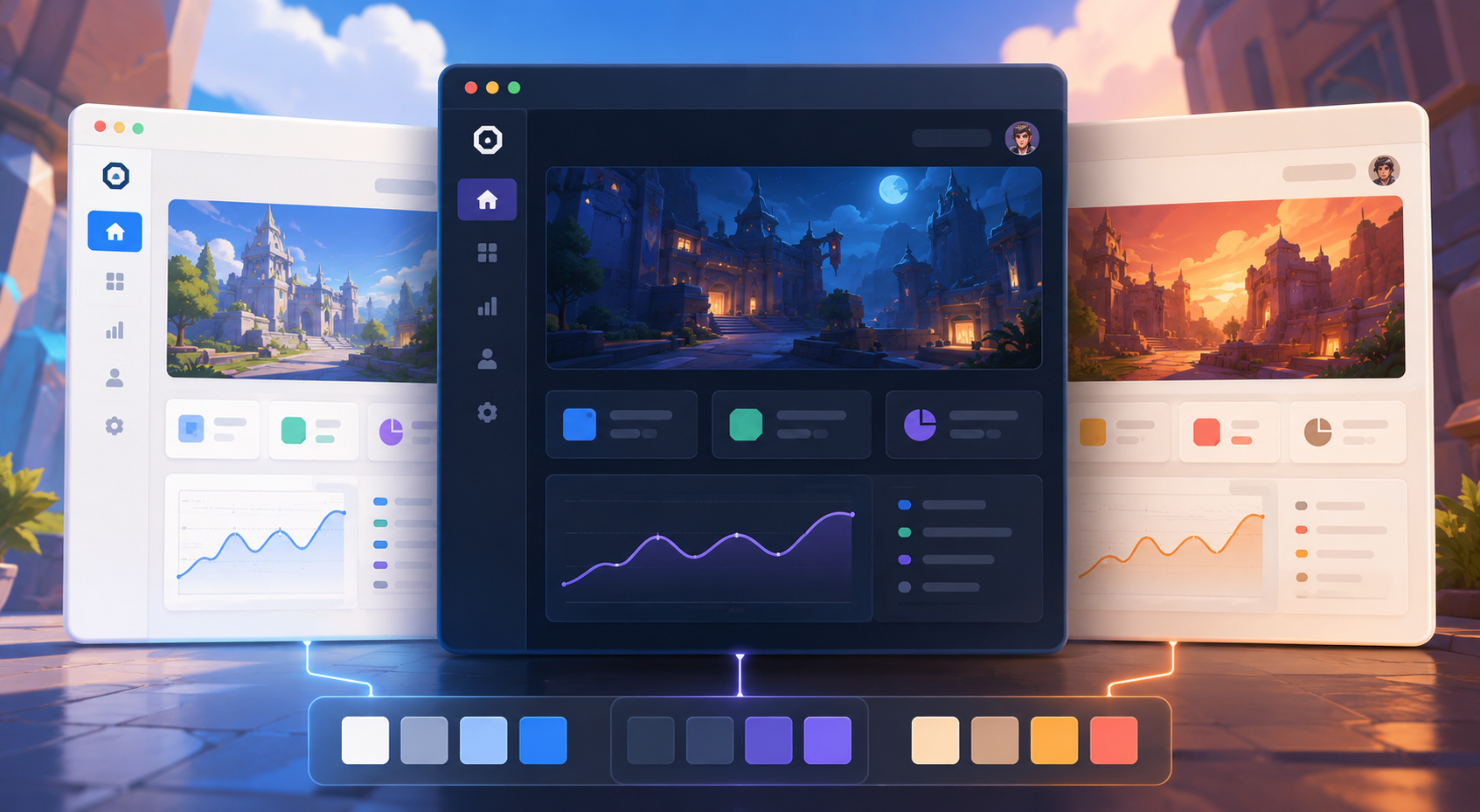
Now, adding a third theme (high contrast) is as easy as adding a CSS block, with no changes to components. That is the goal. The "theme provider" is nothing more than the piece that puts the correct data-theme attribute on the <html> and persists it.
1type Theme = 'light' | 'dark' | 'high-contrast'
2
3const ThemeContext = createContext<{
4  theme: Theme
5  setTheme: (t: Theme) => void
6}>({ theme: 'light', setTheme: () => {} })
7
8export function ThemeProvider({ children }: { children: React.ReactNode }) {
9  const [theme, setTheme] = useState<Theme>(
10    () => (localStorage.getItem('theme') as Theme) ?? 'light'
11  )
12
13  useEffect(() => {
14    document.documentElement.setAttribute('data-theme', theme)
15    localStorage.setItem('theme', theme)
16  }, [theme])
17
18  return (
19    <ThemeContext.Provider value={{ theme, setTheme }}>
20      {children}
21    </ThemeContext.Provider>
22  )
23}
24
25export const useTheme = () => useContext(ThemeContext)1const ORDER: Theme[] = ['light', 'dark', 'high-contrast']
2
3export function ThemeToggle() {
4 const { theme, setTheme } = useTheme()
5
6 const next = () => {
7 const i = ORDER.indexOf(theme)
8 setTheme(ORDER[(i + 1) % ORDER.length])
9 }
10
11 return (
12 <button onClick={next} aria-label="Switch theme">
13 Current theme: {theme}
14 </button>
15 )
16}The provider has exactly one responsibility: keeping the data-theme attribute in sync with the theme state. It does not decide colors. It does not know components. It is a switch, not a decision table.
CSS variables resolve through the cascade, so it is enough to put them on the root element. Any component, however deep in the tree, reads the value of the active theme without anyone passing it down through props or context. The browser does the propagation work for you.
5. Consuming the theme without branches
With the infrastructure in place, this is what a component that used to have three ternaries looks like:
1// No isDark, no ternaries, no knowledge of the theme
2function PriceTag({ amount }: { amount: number }) {
3  return (
4    <span
5      style={{
6        color: 'var(--color-text-primary)',
7        backgroundColor: 'var(--color-background)',
8        borderColor: 'var(--color-border-subtle)',
9      }}
10    >
11      {amount} €
12    </span>
13  )
14}
The component lost the isDark prop, lost the ternaries, and gained total independence from the theme. If tomorrow there are five themes, this component stays exactly the same.
Tailwind follows the same idea, only the semantic tokens live in the config and the runtime maps them to the CSS variables:
1// tailwind.config.js maps 'surface' -> var(--color-surface)
2function PriceTag({ amount }: { amount: number }) {
3  return (
4    <span className="text-text-primary bg-surface border-border-subtle border">
5      {amount} €
6    </span>
7  )
8}
No dark: and no duplicated variants per class. The utilities point to semantic tokens and the theme resolves underneath. The key is that the class name describes the role (bg-surface), not the color.
A good theming system is not the one that supports dark mode. It is the one that makes adding dark mode (or any other theme) require no touching of the components.
6. Edge cases: when you really do need to know the theme
It would be dishonest to say you will never need the theme in code. There are legitimate cases, but they are few and very specific:
- Different images or illustrations per theme: sometimes a logo needs a light version and a dark one. Here the token is not enough because what changes is the asset, not a color.
- Third party libraries that do not read CSS variables: a map, a code editor, a chart. They need to be passed an explicit color config.
prefers-color-schemeas the initial value: respecting the operating system preference the first time the user comes in.
For those cases, useTheme() is still there. The difference is that now it is the documented exception, not the default pattern:
1function BrandLogo() {
2  const { theme } = useTheme()
3  const src = theme === 'light' ? '/logo-light.svg' : '/logo-dark.svg'
4  return <img src={src} alt="Logo" />
5}
And for the initial value based on the system, you do not even need JS: a media query does the work before anything loads.
1@media (prefers-color-scheme: dark) {
2  :root:not([data-theme]) {
3    --color-surface:      var(--gray-900);
4    --color-text-primary: var(--gray-50);
5  }
6}
The danger of having useTheme() available is that it creeps back into places where it is not needed. The rule: if what changes is a color, it is a token; if what changes is an asset or an external config, then yes, the hook should be used.
7. Conclusion: theming as infrastructure, not as logic
The difference between a dark mode that hurts and one that does not is set by where the color decision lives. If that decision is spread across ternaries all over the components, every new theme is a hunt through the code. If it lives in a table of semantic tokens that a provider resolves at a single point, adding a theme is one CSS block.
The path is always the same: primitives that never change, semantics that name intent, components that only consume semantics, and a provider that limits itself to putting the correct attribute on the root. With that, it is not that you remove if (isDark) by hand: it is that you never have a reason to write it.
And that is the real indicator that you have done it right. Not that your dark mode is pretty, but that you can add the next theme without opening a single component.